Art Deco Graphic Design Style
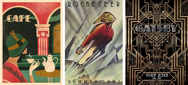
Ever felt like you've stepped into a 1920s film set while browsing through a vintage poster collection or admiring the geometric patterns on an old book cover? That, my friend, is the unmistakable charm of Art Deco graphic design style. It's like the Great Gatsby of design aesthetics - bold, glamorous, and utterly captivating.
Born in the Roaring Twenties
Art Deco wasn't just a design style; it was a cultural phenomenon that swept through the 1920s and '30s like a glittering, geometric tsunami. Born out of the Bauhaus movement and the Paris Exposition des Arts Décoratifs et Industriels Modernes (that's a mouthful, we know), Art Deco was all about embracing modernism, technology, and the thrill of the new.
Think of it as the original 'less is more' design philosophy, but with a whole lot more bling. It was about streamlining, simplifying, and celebrating the beauty of geometric shapes and bold colors. And let's not forget the glamour - Art Deco was as much about luxury and opulence as it was about functionality.
Geometric Glamour
At the heart of Art Deco graphic design is geometry. Circles, squares, triangles, and zigzags - you name it, Art Deco designers used it. They combined these shapes in bold, eye-catching patterns that danced across posters, book covers, and advertisements. It was like they took a ruler and a protractor and said, "Let's make this world a more interesting place."
Take, for instance, the iconic Art Deco poster for the 1925 film 'Ben-Hur: A Tale of the Christ.' It's a masterclass in geometric design, with its bold, stylized figures and dramatic, angular composition. It's not just a movie poster; it's a visual symphony of shapes.
Color Me Impressed
Art Deco wasn't just about shapes; it was also about color. Bright, bold, and often contrasting colors were used to create eye-popping designs that demanded attention. Think primary colors clashing with gold and silver, or rich, jewel tones set against stark black and white.

One of the most famous Art Deco color palettes can be seen in the 1928 film 'The Broadway Melody.' The film's vibrant, contrasting colors - think deep blues, fiery reds, and shimmering golds - were so striking that they influenced the design of the film itself, with sets and costumes echoing the bold, geometric patterns of Art Deco design.
Typography: The Unsung Hero
While Art Deco is often associated with its bold, geometric shapes and vibrant colors, its typography is equally noteworthy. Art Deco typefaces were often stylized, with exaggerated forms and geometric influences. They were designed to be as eye-catching as the designs they accompanied.
Take, for example, the Futura typeface, designed by Paul Renner in 1924. With its clean, geometric lines and sans-serif design, it was the epitome of Art Deco typography. It's still widely used today, from street signs to corporate logos, a testament to its enduring appeal.

Bringing Art Deco into the 21st Century
So, how can you incorporate a bit of Art Deco glamour into your daily life? Well, you could start by raiding your local vintage store for some Art Deco-inspired home decor. Think geometric vases, boldly patterned rugs, and sleek, streamlined furniture.
Or, if you're feeling crafty, why not try your hand at some Art Deco-inspired graphic design? You could create some geometric patterns using a simple drawing app, or even design your own Art Deco-inspired poster. Who knows, you might just become the next Erté!
But even if you're not ready to dive headfirst into the world of Art Deco design, you can still appreciate its influence on our daily lives. From the sleek, streamlined design of modern skyscrapers to the bold, geometric patterns on our favorite graphic tees, Art Deco's legacy lives on.
So next time you find yourself admiring a vintage poster or a stylized typeface, take a moment to appreciate the artistry and innovation of Art Deco design. It's not just a style; it's a celebration of the beauty of geometry, the power of color, and the thrill of the modern world.